Global News - Responsive web design

Global News Canada
1.5 years
Director of Product
Project manager
3 developers
2 Quality Analysts
Senior UI/UX designer, as a sole designer I led every user research activity from planning to result synthesizing. I created the design system and designed the new Global News experiences as well as tested them.
The challenge
Being the 2nd best news website in Canada with 21 local newsrooms and a national reporting desk, 7 AM radio stations and several more FM stations Global News aspired to be the best in the country. Their aim was to improve the overall user experience of the site as well as grow and retain the audience by building trust.
The solution
A fast, responsive news website that highlights not only national stories but focuses on good local reposting as well. Address editorial pain points regarding the content management system and drive overall ad revenue without compromising on the user experience.
The process

01Empathize
As an important, foundational step, I wanted to understand what Global News was trying to solve. To do this I needed to get to know the people working on the website aka the stakeholders. Global News being a really large organization with various departments and news categories, I needed to get a holistic picture of the issues from different perspectives and this led me through one-on-one interviews with 24 stakeholders.
With insights received from stakeholders and preliminary analytic review, we began drafting questions for the user survey. We ran the survey on the website, through newsletters and even social media receiving nearly 5000 responses. Here’s some responses from our users:

Before moving into defining the project I had to take a deeper dive in for myself and have a look at the existing site. We created an information architecture or sitemap for the existing site since that didn't exist and did an in-depth analytical review on using different mediums like Adobe Omniture for the website, Google analytics for demographic data, Facebook and Youtube analytics for social data. And last but not least find out who the competition is and what are our strengths and weaknesses.
02Define
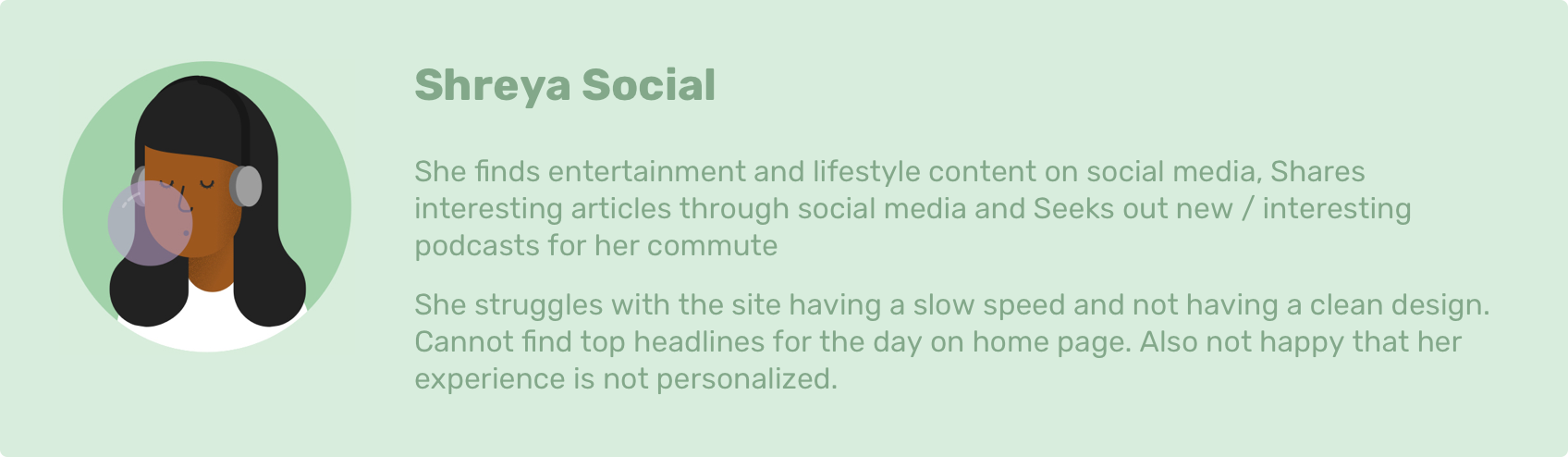
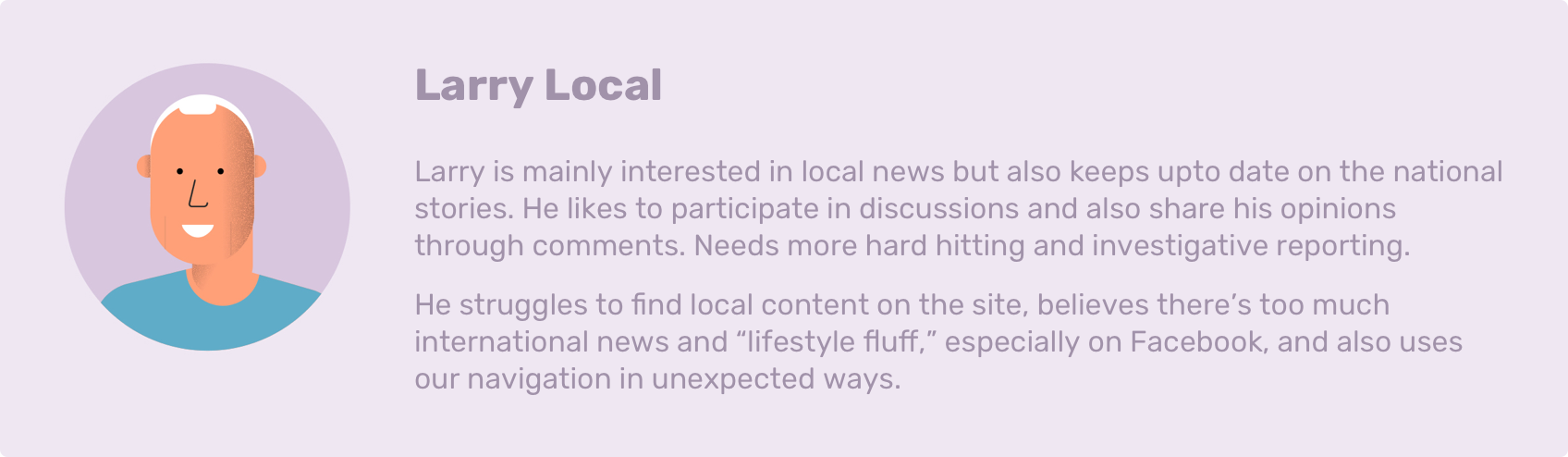
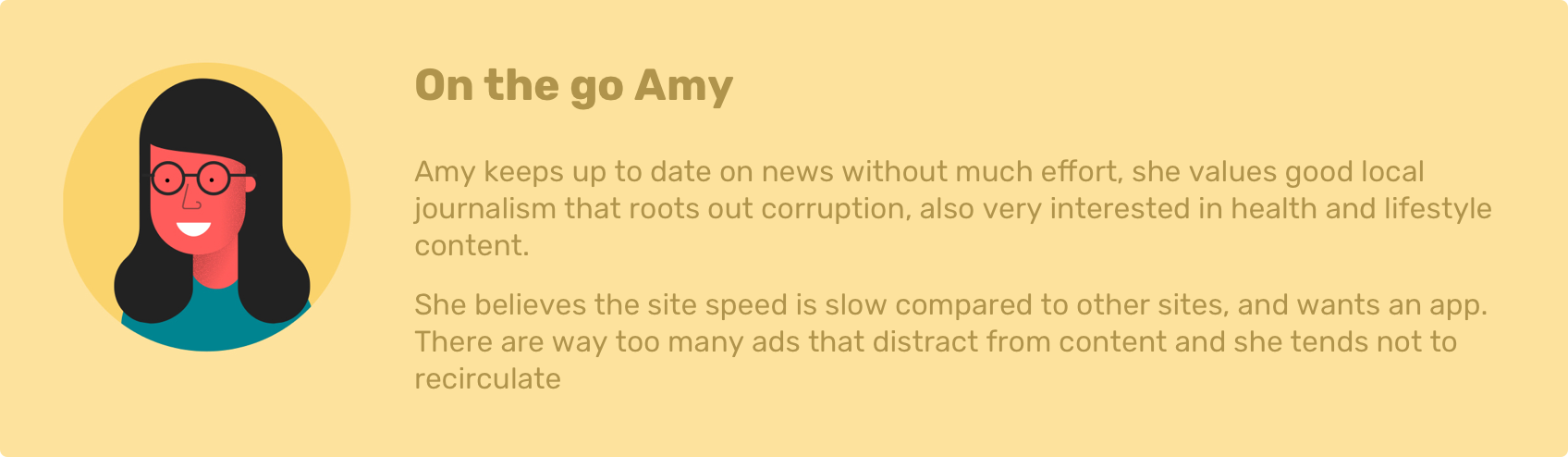
This phase heavily relied on the earlier research, understanding our audience and creating user and stakeholder insights to form personas. This allowed me to not only better cover evident issues and focus on what's important but also create a roadmap of the things we need to fix and how and when they need to be tackled.
Using personas to identify pain points
Once I had a clear picture of the problems I wanted to know who we were designing the solutions for. Keeping in mind our audience is not necessarily coming straight to the site but we have a diverse presence through different social channels and this attracts users of different age groups.
Defining the problems
We nailed down the major things we needed to accomplish:
- Speed
- Content
- User experience
- Community
Users as well as the editors were facing a lot of lag due to the old and piled on code of the existing CMS.
Users and editors could not find articles on the homepage as they were still using a blogroll system to display articles.
Since the current website was last designed in 2013 it lacked accessibility and felt really bloated and clunky.
The website lacked in promoting local news, contests and events around you, in turn reducing the sales opportunities.
Value vs effort mapping
Now that we know the problems and what we need to work on we had to break the site down to find out how we are going to tackle the redesign. We wanted to deploy the site gradually to the user’s page by page making sure we test the experiences as we go. We decided to employ the value vs effort map, and as the name suggests we plotted the pages based on the value (user engagement) vs the effort (time taken to deploy), making it easier for everyone to understand why we chose a particular page to work on before the other.

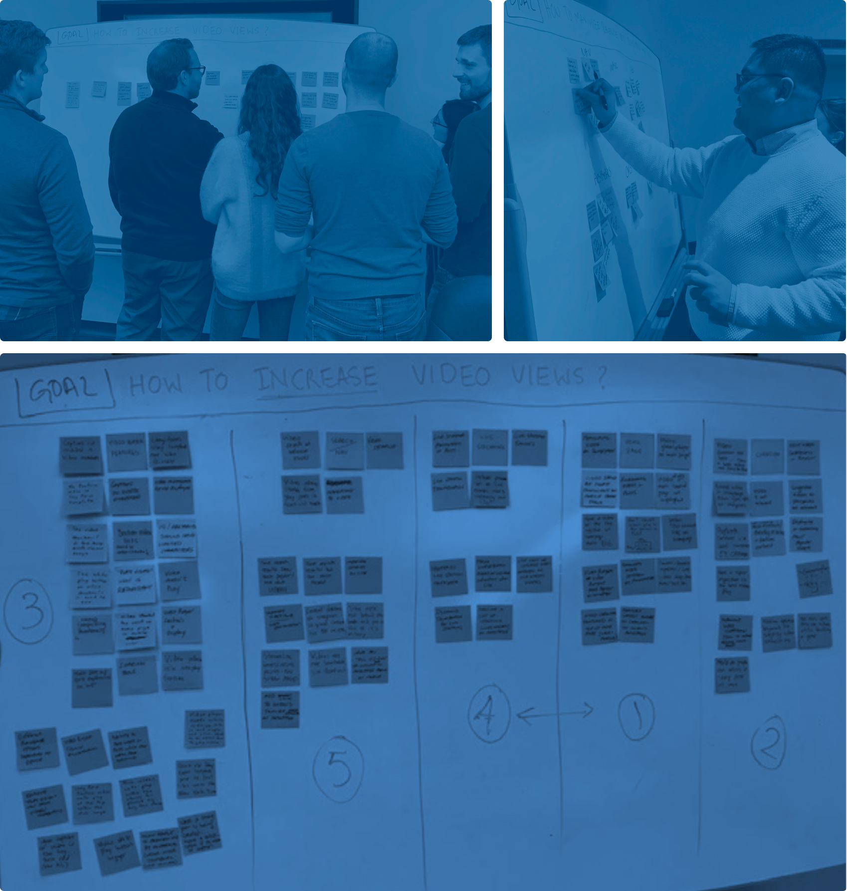
03Ideate
Affinity mapping workshop
Everyone was interested to have an input into the ideation phase of the project and we thought this would be the best time to organize some team activity/workshop to brainstorm ideas. We conducted affinity mapping with 9 different teams to find out what their major issues were, and brainstorm ideas on how we could better solve them.
Concept sketches
With some really good ideas from the workshop, we proceeded with initial sketches on how we want the new navigation and article pages to be.
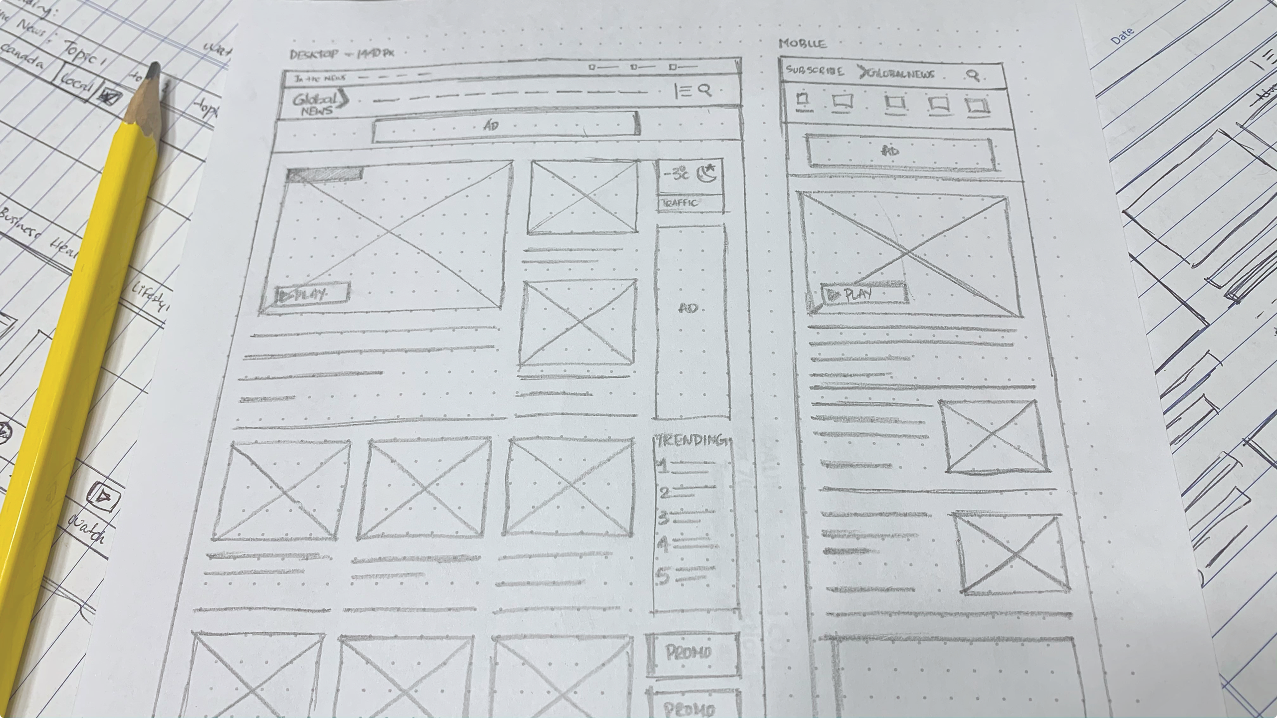
Final wireframes
After a series of iterations and changes with internal stakeholders, we finally had the wireframes complete for the first phase of the project.
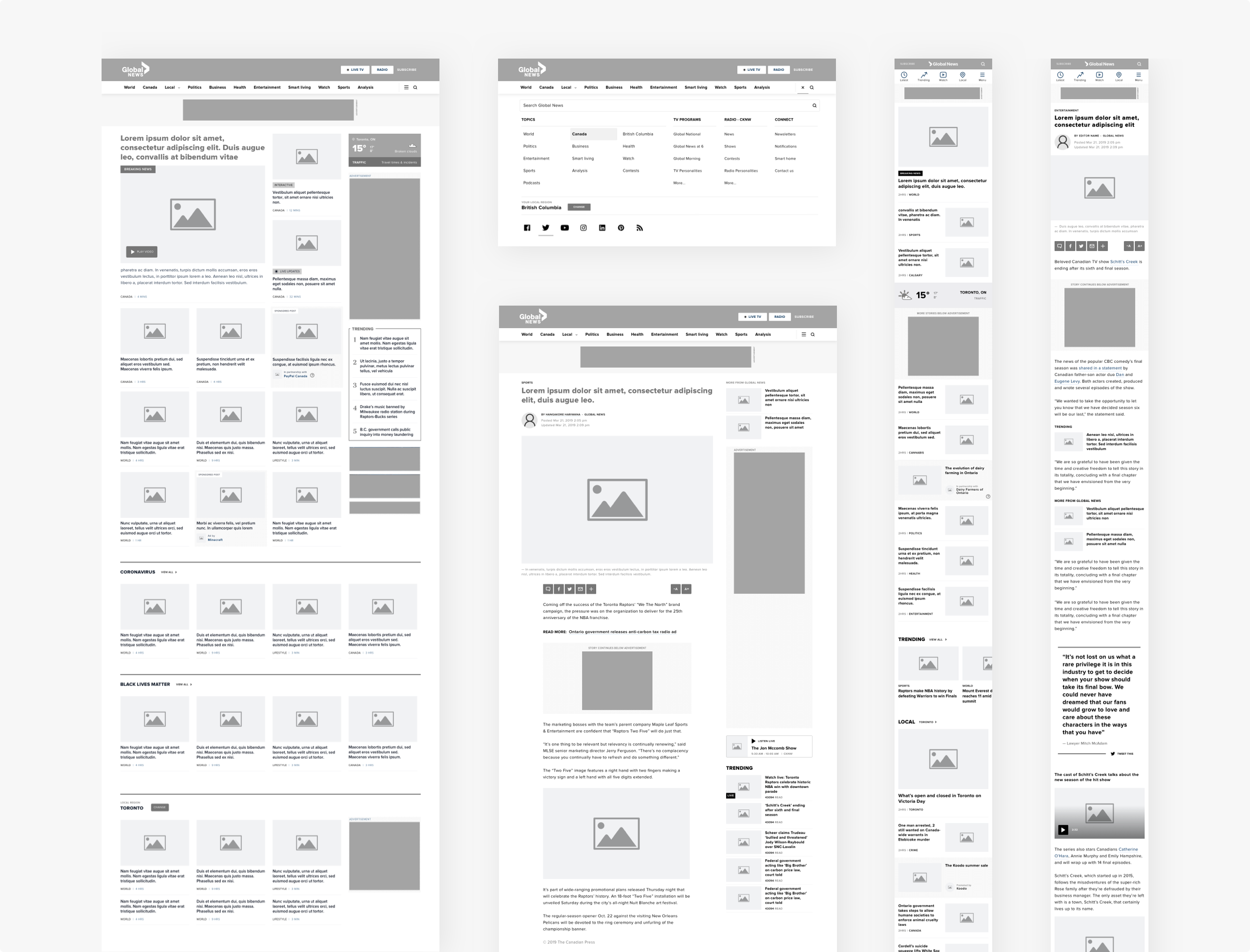
04Design
Once we had the wireframes ready we moved into designing the new experience for Global news website. Making sure we followed the existing styleguide created for the broadcast presence, we made a few changes to make sure we adhere to the minimum AA accessibility standard.

Designs
We started work on the header and footer for the new site first then moved to the most important part on the site which was the article page.
article pages
When it came to the article page we had a lot to look into. As this was the entry point to the site for most of our users from search results and social channels, we needed to make sure we increased the recirculation rate from this page and reduce the bounce rate. We also made sure we focused on improving the ad experience as we didn’t want the ads to be an afterthought.

homepages
After the article page, we focused on the homepages that included the national and the 21 local homepages. Users were not very happy with the current site as they couldn’t find local news. We needed to make sure the homepage was easy to navigate and well organized with dedicated sections for top curated news, geo-detected local news section, highlight on the local radio and community sections.


Here on out, we worked on many more pages like the category page, tag pages, radio pages and also took on a great challenge during the COVID pandemic by creating a new article page template for the pandemic update for national and different provinces. We cannot take all the credit for ourselves but with everyone working from home and the editor pushing through important news and live coverages on the site we did manage to become the #1 news site in Canada for some time. We also hit a record number of page views per day in Global news history with over 9 million page views per day.

The final front end project was creating a new longform template for the long reads and Global News original content and investigations. We redid the entire template from ground up with existing features and some new features for the editors to customize the template and personalize each article or series.

The last project for me at Global News was to clean up the editorial workflow. This meant another round of interviews and shadowing editors to find out more about their pain points on the way they create and curate stories. But we made sure we didn’t just concentrate on the CMS issues we wanted to get to know more about their workflow and their process, this brought out some interesting issues that are outside of just the CMS like communication, lack of training and disjointed collaborative tools.
We have cleaned up the editorial flows by improving the experience and clearing up any legacy sections and elements. We also brought in some smaller improvements to the CMS to cut down on time spent to do a particular task.
05Test
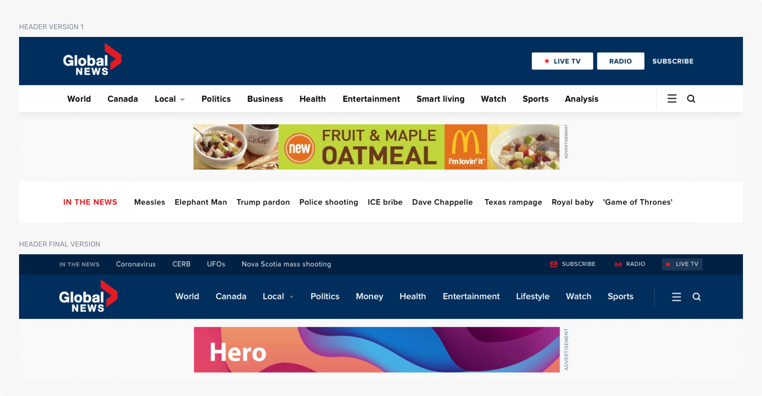
Testing your ideas is a crucial part of the whole process, it’s always a better idea to test the designs with a smaller group of people to realize if there are any potential drawbacks to the designs. One good example was when we used billboard ads in the header section of the site; these were too big and pushed the content down lower, testing this out with 2.5% of our audience and gathering feedback made us realize we need to change it, this made a huge difference in audience ratings.
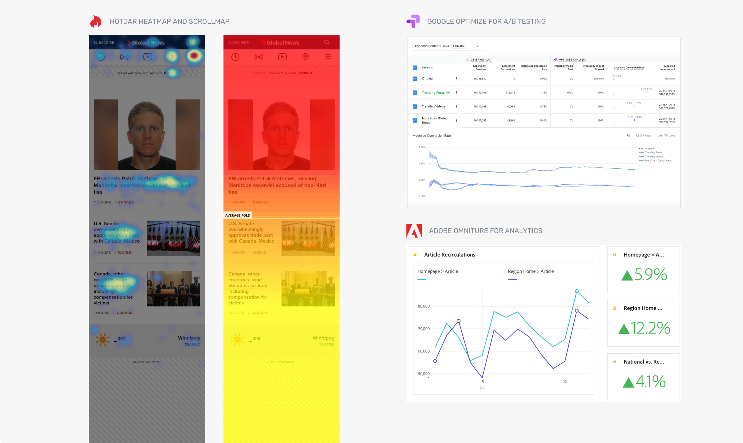
Just like the site design approach we started testing the newly designed pages one by one as they were completed using A/B testing tools like Google Optimize and heat mapping, user feedback and video recording tools like Hotjar. We set up custom workspaces on Adobe Analytics to monitor clicks in different regions, page recirculation and even bounce rates. We even monitored and tweaked the ad viewability and optimized revenue generated per page using tools like Moat and others.
Conclusion
I was really excited to work on such a large project with a really talented team. At times it was difficult to maintain communication with so many teams and stakeholders involved all over the country but we made sure we tested out all our designs before going live and were able to back our designs and make evidence-based decisions. So what did we accomplish?
60% faster page load speed
65% lower bounce rate
12% higher recirculation rate
71% higher time spent per visit
12% higher ad viewability
132% higher notification interaction
49% of higher mobile social shares
41% revenue increase
and much more
Thank you so much for scrolling this far and taking the time to go through my design decisions and solutions for this great project. If you would like to talk more about the project please reach out or check out Global News website.